
Project Brief
The goal of this project was to design a responsive website that is easy to use. It explores current design trends while staying true to the brand. The new design aims to inspire a new audience to visit the Capilano River Hatchery online and in person.
Problem
The Capilano River Hatchery currently lacks a dedicated website, making it difficult for users to find structured and accessible information about its purpose and visitor experience. This lack of a clear digital presence can reduce engagement and make it harder for new audiences to discover and understand the hatchery.
Mobile Home Page
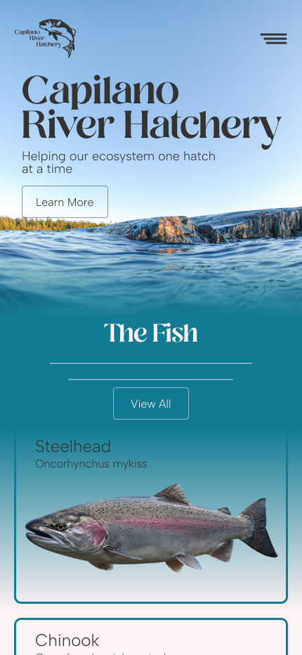
This page is designed to help users quickly understand the purpose of the hatchery and its role in conservation. Clear calls to action guide users toward learning more about the fish species and encourage in-person visits.
Desktop Home Page
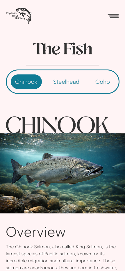
Mobile Species Page
To improve navigation, a tab-based system allows users to quickly switch between fish species without losing context. This reduces cognitive load and makes information easier to explore.
Desktop Species Page
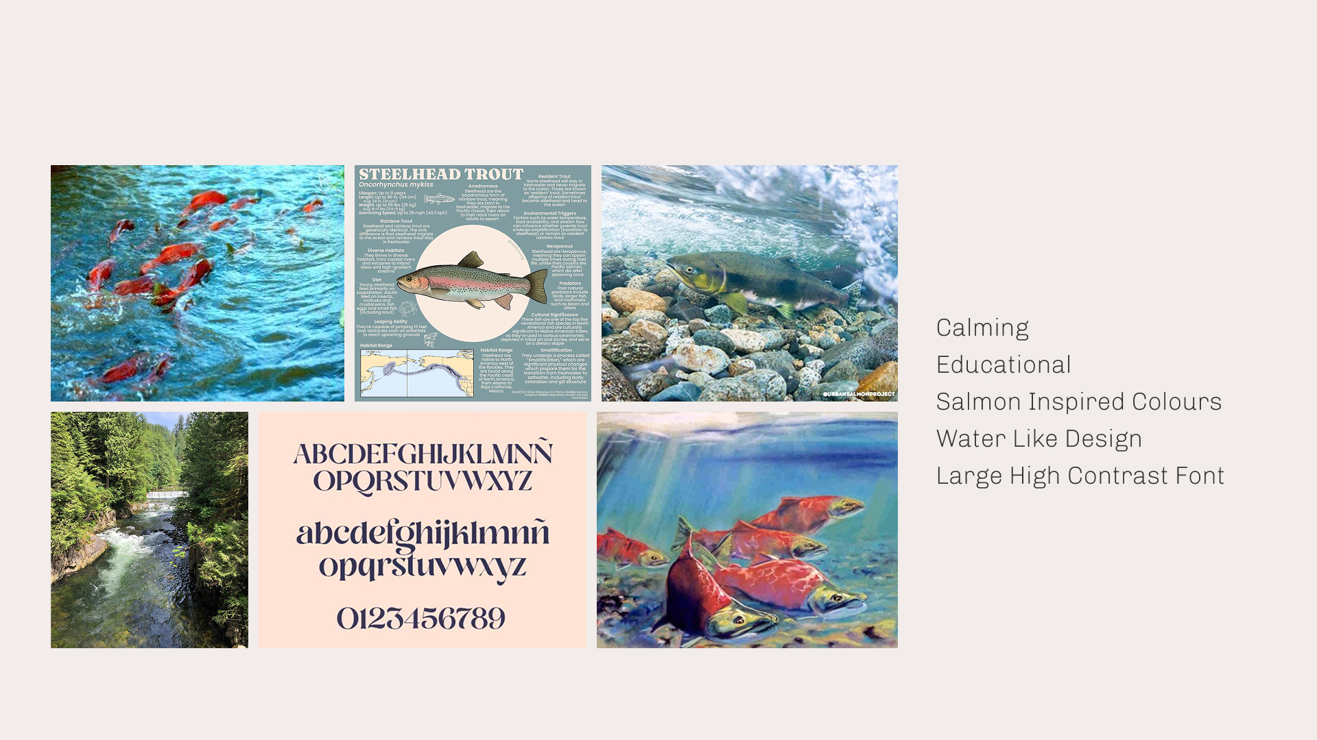
Art Direction
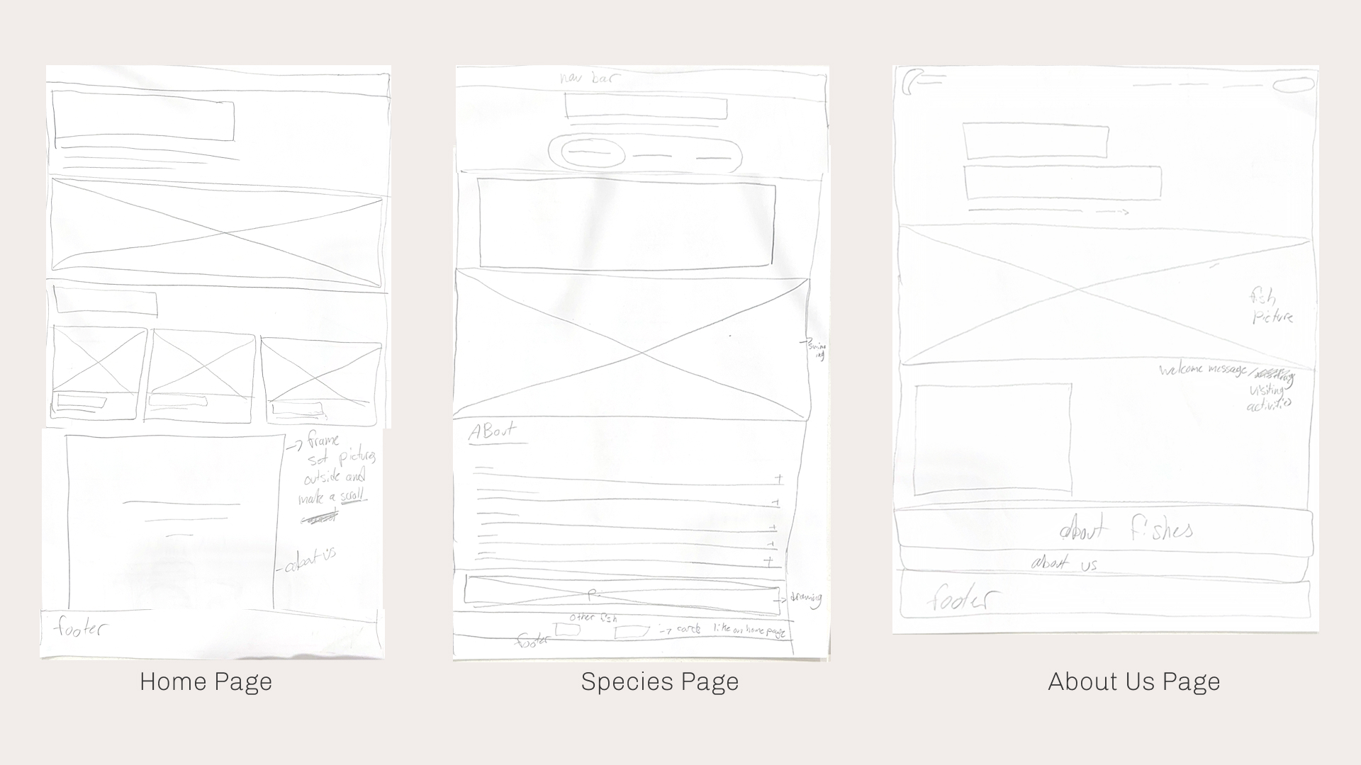
Wireframes
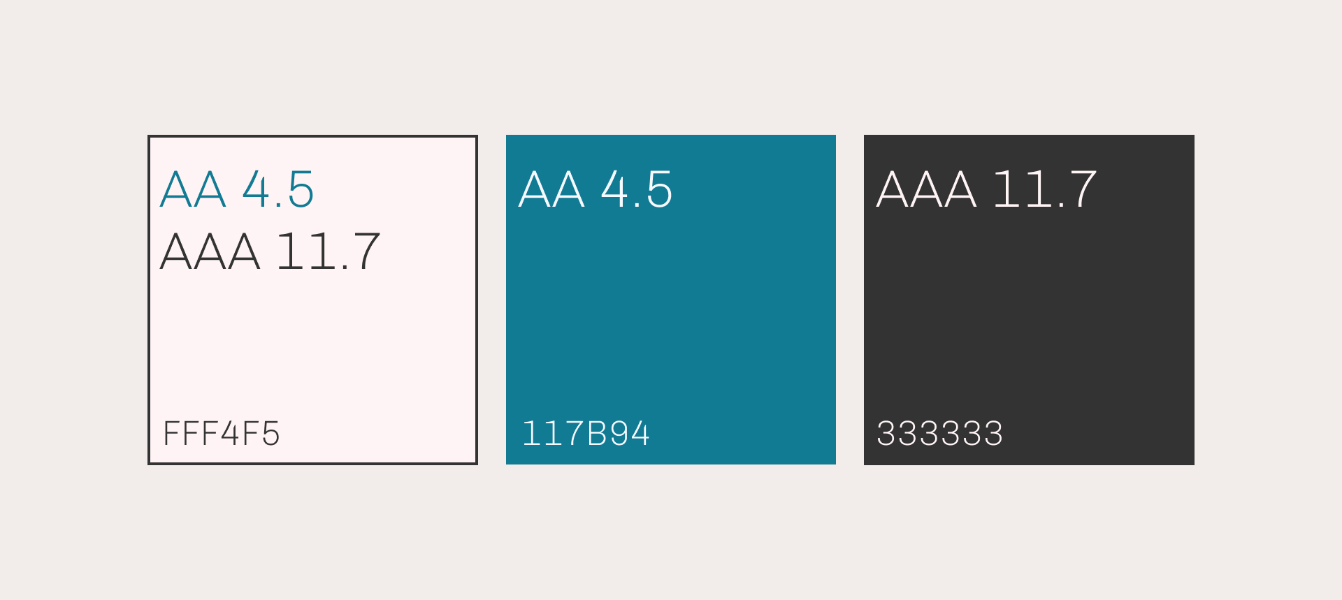
Colour Palette
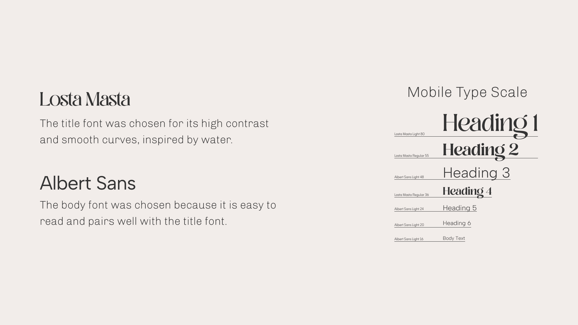
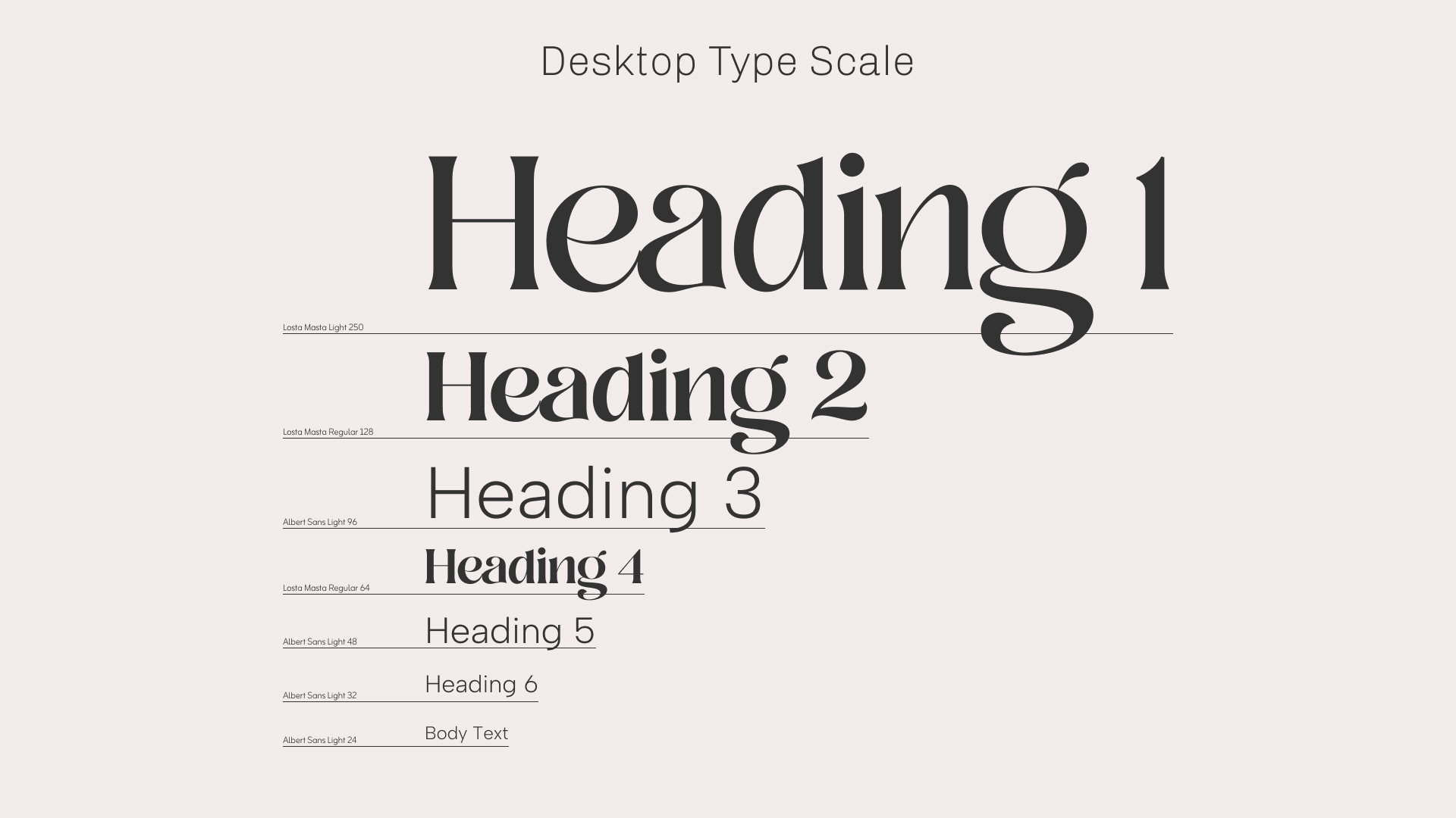
Typography
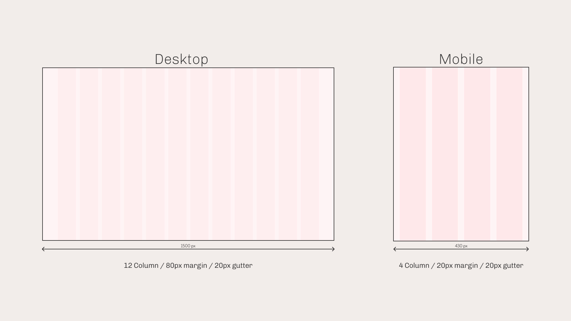
Layout
UI Components
Buttons & Link Text
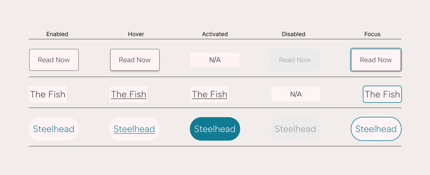
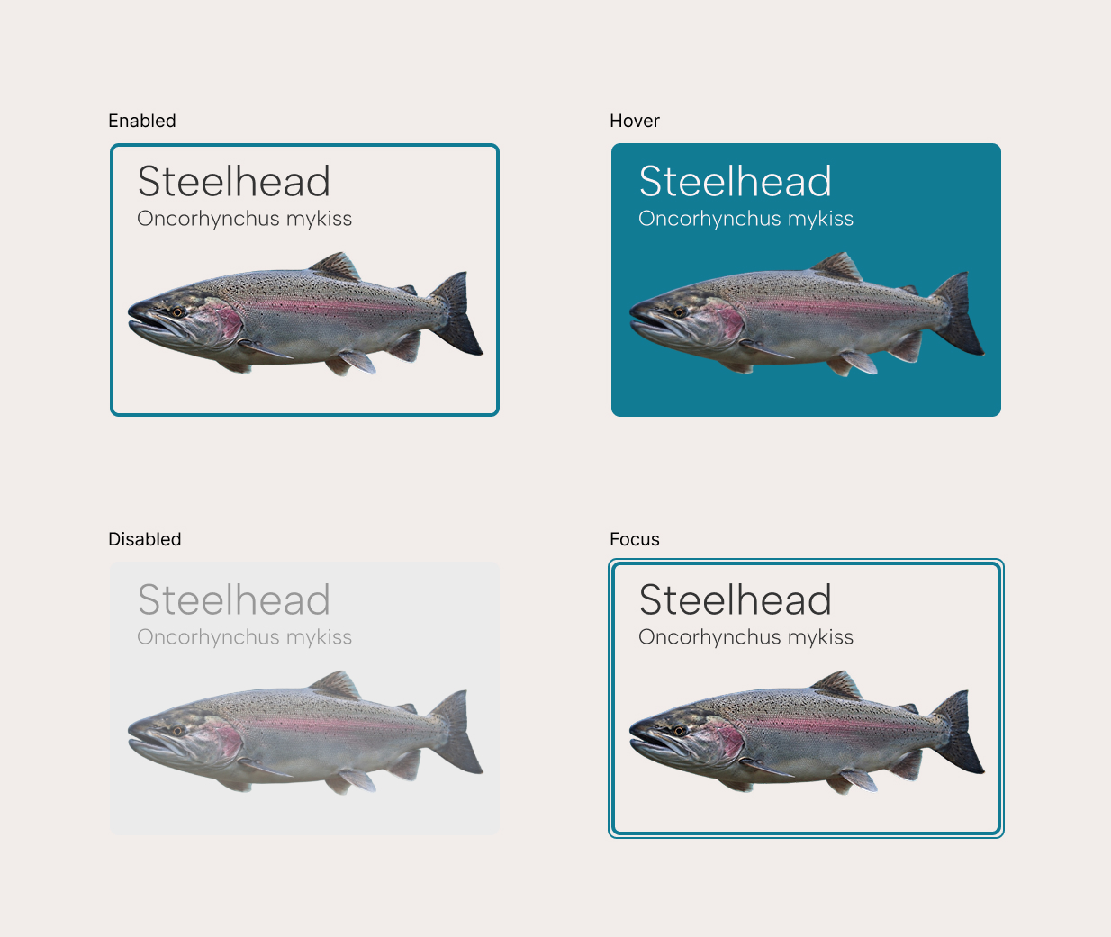
Cards
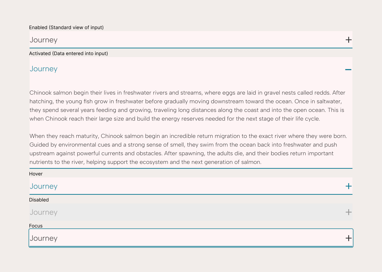
Accordion
Reflection
This project strengthened my ability to balance visual design with usability. One challenge was creating an engaging interface while keeping information clear and accessible. Through this, I learned the importance of thoughtful layout systems and consistent components in building a cohesive experience. Moving forward, I would focus on user testing and accessibility improvements to further refine the design. This project reinforced the value of making intentional, user-centered design decisions.